

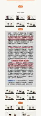
The website struggled with several key issues:
The course description was vague, leaving potential students confused about the content and benefits.
Too many testimonial videos prevented users from finding relevant or meaningful feedback.
The course failed to compare itself with traditional in-person vocal coaching, missing a chance to highlight its unique advantages.
The absence of an engaging headline and sub-headline failed to immediately captivate or resonate with visitors.
A disorganized structure with excessive text made the website difficult to navigate and unappealing to potential students.
We applied a tailored content strategy session, transforming the website into an engaging, conversion-focused platform:
The new website features a succinct and engaging explanation of the course, highlighting its core value proposition — empowering students with expert techniques in a flexible, online format.
We reorganized content around a compelling narrative that addresses:
•Problem: Challenges of finding affordable, effective vocal training.
•Solution: The coach’s proven methods, conveniently offered online.
•Product: A structured course designed to deliver real results.
We curated testimonials for maximum impact, balancing short text reviews with select, high-quality videos that provide credibility and visual appeal without overwhelming users.
We created a new section contrasting this course with traditional in-person lessons, highlighting:
•Affordability
•Accessibility from anywhere
•Tailored one-on-one feedback in a virtual setting
•A new headline “Sing from Your Heart and Soar Freely in the World of Music.” immediately captures attention.
•A sub-headline “Join the course now and unleash the singer within” starts with a clear call-to-action, motivating users to take immediate steps, while tapping into the audience’s desire for self-expression and personal growth, creating an emotional connection.
The new headline and sub-headline convey the message succinctly, ensuring it’s easily understood at a glance, and inspire readers by suggesting they already have untapped potential, encouraging curiosity and engagement with the course.
We organized visual and textual elements into scannable sections, employing infographics where needed to simplify complex information. This structure streamlines navigation and keeps users engaged.



•Improved Engagement: Visitors now spend more time exploring the website, thanks to the structured, engaging content.
•Higher Conversions: Clear messaging and focused calls-to-action guide users to book consultations or enroll in courses.
•Stronger Brand Positioning: We now present the coach’s online course as a competitive, professional, and accessible option in the vocal training market.
The pitch deck faced several significant challenges that undermined its effectiveness:
The deck lacked a cohesive narrative to showcase the startup’s technical strengths and revenue-generation strategy, leaving investors unclear about the business value.
Text-heavy slides cluttered with excessive information and lacking visual appeal made the deck hard to follow and unengaging for investors.
The design and tone felt generic, failing to reflect the founder’s engineering background or innovative vision.
Long descriptions buried key points, and sections neglected to provide confident, concise summaries of their relevance and importance to investors.
Through a strategic redesign and storytelling consultation, the pitch deck was transformed into a polished, investor-focused presentation:
1. Compelling Storytelling
A powerful narrative highlighted the technical value and business potential of the idea, emphasizing a unique value proposition that resonated with investors.
2. Aesthetic Design
Sleek, modern visuals now reflect the founder’s technology-driven mindset and engineering expertise. The updated color scheme, typography, and layout convey innovation and professionalism.
3. Concise and Clear Content
Concise, impactful statements replaced long-winded descriptions. Clearly delineated sections allow investors to grasp key messages quickly.
4. Confident Summaries
Each slide concludes with punchy, confident summaries of its key message, ensuring investors understand its importance. These summaries inspire confidence and deeply connect with the target audience.
The original brand story struggled to emotionally connect with its target audience. It relied heavily on technical details, creating an informative but impersonal narrative that failed to inspire trust or highlight the everyday impact of the brand’s cutting-edge technology. The story required a shift from a purely technical focus to one that emphasized human-centric appeal.
The lack of a clear structure further weakened the story. It needed a compelling introduction to the problem, a clear resolution, and a succinct mission statement. Dense descriptions buried the unique value proposition (UVP), making it difficult for the audience to quickly understand what set the brand apart.
Through strategic storytelling, the brand story transformed into a clear, engaging narrative that resonated with its audience. The reimagined approach focused on these key areas:
The new story framed the status quo by highlighting the frustrations homeowners face with traditional locks and the flaws in existing biometric technologies. This approach immediately connected with the audience on an emotional level.
The narrative introduced the conflict by addressing the shortcomings of current security solutions and the untapped potential of iris recognition technology. It concluded with a powerful resolution, positioning the brand as the innovator bringing military-grade iris recognition to everyday home security, blending simplicity and reliability.
A concise mission statement emphasized the brand’s purpose of bridging advanced technology with practical home applications. The UVP became the cornerstone of the story, clearly showcasing the product’s unique combination of precision, reliability, and convenience.
The story balanced technical authority with emotional resonance, portraying the brand as not only a leader in technology but also a champion of everyday convenience and peace of mind.
The reimagined brand story created a powerful transformation:
•Emotional Connection: Human-centric storytelling resonated deeply with the target audience, making the technology approachable and relevant to their lives.
•Clear Positioning: Prominent presentation of the UVP and mission statement allowed the brand to stand out in a crowded market.
•Engaging Narrative: The structured status quo-conflict-resolution framework made the story easier to follow and more compelling.
•Brand Differentiation: By highlighting the everyday benefits of military-grade technology, the story positioned the brand as a unique solution in the home security space.
Before the redesign, the website struggled to connect with its target audience: small business owners and team managers. The site faced the following challenges:
Generic headlines in the hero section failed to address customer pain points or highlight the app’s benefits.
The content lacked a storytelling framework to guide users through the problem, solution, and product value.
Plain, text-heavy sections lacked visual elements to capture attention or build trust.
The absence of relatable images or testimonials left the app feeling impersonal and failed to showcase its positive impact on users.
The original site ignored SEO strategies, leading to poor search engine visibility and limited organic traffic.
The website overhaul transformed the platform into an engaging, conversion-focused experience by implementing the following improvements:
The content was restructured to address customer pain points, such as frustrations with manual time tracking, introduce the app as the solution, and highlight its key features and benefits with clear, relatable messaging.
The hero section now directly targets the audience with a bold headline and a data-backed subheadline showcasing performance improvements like “93% increase in accuracy” and “5+ hours saved weekly.”
Happy user profiles and testimonials were added to build trust and credibility.
The redesign introduced clean, modern layouts with vibrant visuals, including product screenshots and smiling user images to draw attention and convey reliability.
Icons and infographics now break up text, making the content more digestible.
User testimonials and case studies showcase real customer benefits, emphasizing the app’s intuitive interface and productivity-boosting features in a way that resonates with busy managers and team leaders.
Long-tail keywords and advanced technical SEO strategies optimized the website for search engines, improving visibility and driving organic traffic growth.
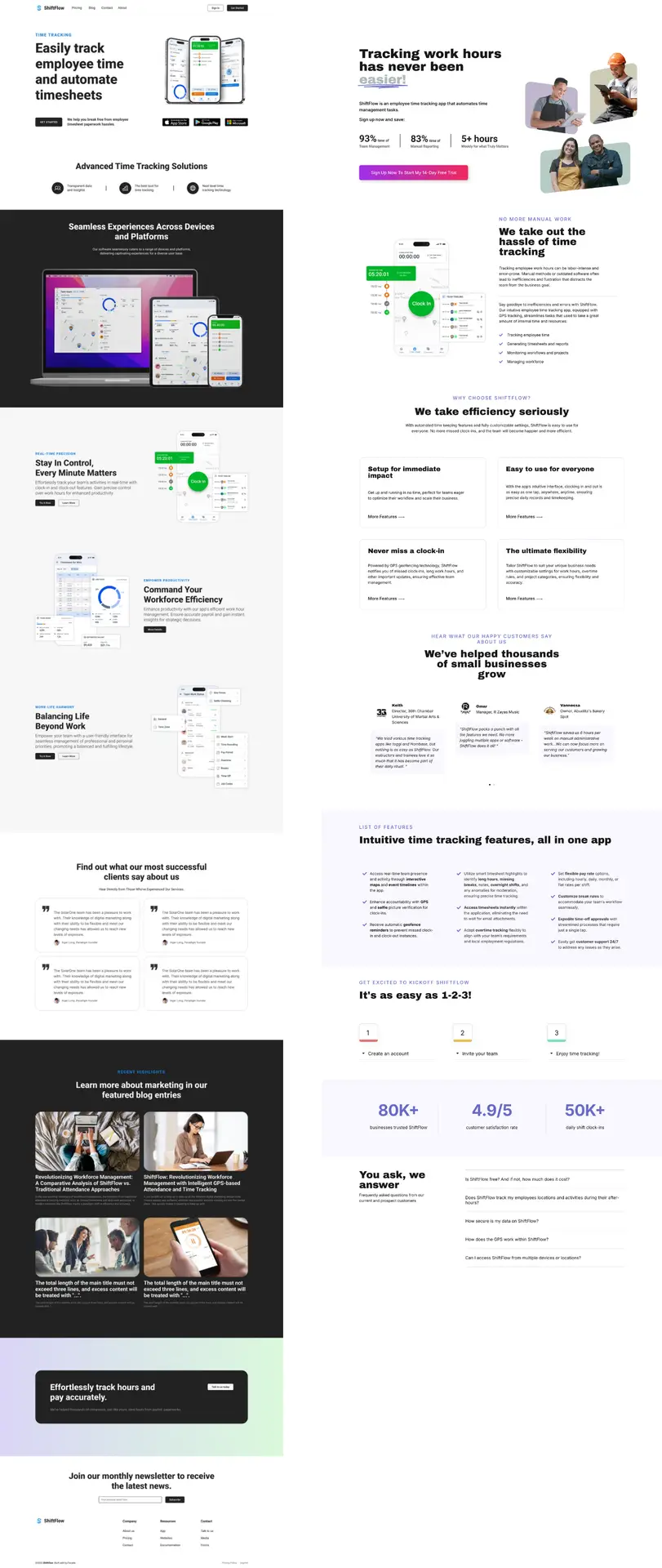
The website overhaul transformed the ShiftFlow platform into an engaging, conversion-focused experience. (Click on the image to expand; Left side: Before; Right side: After)
The redesigned website successfully transformed ShiftFlow’s online presence:
•Improved Engagement: Clear messaging and relatable visuals helped visitors quickly grasp the app’s value, increasing time spent on the site.
•Stronger Conversion Potential: The problem-solution-product framework created a compelling narrative that guided users toward signing up for a free trial.
•Brand Credibility: Testimonials and performance data reinforced the app’s position as a trustworthy and effective solution for employee time tracking.
•Significant Traffic Growth: The site achieved a 332% increase in traffic within three months and a 250% boost in engagement, showcasing its improved ability to attract and retain visitors.

Collaborate with a leading professional in content strategy to uncover and showcase your authentic voice.
1854 Belburn Dr, Belmont, CA 94002
© 2025 All Rights Reserved.